I recently analyzed the 2011-2015 Boston Marathon results. You can see the results in this GitHub Repo, or go straight to the IPython/Jupyter Notebook for the details.
Boston’s getting competitive
One of the more interesting observations is that with the tighter qualifying standards the race is much more competitive. Runners have apparently responded by stepping up their game, or perhaps, the race is now limited to faster runners.
The combination of a -5 minute adjustment across the board combined with the “fastest get in first” rule has created a much more competitive environment. This can be seen by comparing the distribution of finishing times for the M18-39 age group from 2011 (before the changes) to 2015 (the most recent year). (Both years generally were “fast”, as measured the mean and median finishing times)

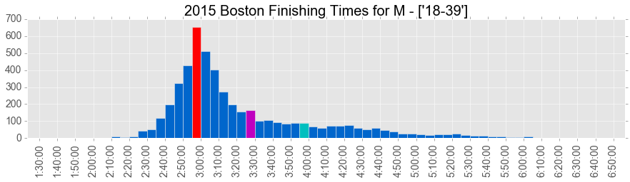
You can see that the mode (most frequent bin) has been pushed from sub-3:10 to sub-3:00. This is very impressive for such a large race.
Check out the full results for more details!